Nutrition tools
The best macro tracker app: what actually separates them
The best macro tracker app is the one whose numbers you still trust in week six, and two things decide that: how the app derived your targets, and how much it costs you to correct it when it guesses wrong. Nearly everything else in a feature comparison is decoration. If the derivation is crude, you are chasing a number that was never right for you. If correcting a wrong estimate takes six taps, you will stop correcting, and within a fortnight your log will be quietly, confidently inaccurate.
Here is what to check before you commit, including one arithmetic trap that makes a lot of people think macros "don't work for them" when they have simply been reading the wrong unit.
The six checks that actually predict whether you'll stick with it
- Does it show grams, not just percentages? Percentages hide missed protein on low-intake days. Explained in full below.
- How many activity options does the onboarding offer? Three is a red flag. The underlying equation supports a much wider range.
- Can you see the formula behind your target? If the app will not tell you where 2,340 kcal came from, you cannot audit it when progress stalls.
- How many taps to fix a wrong entry? Time it. This is the number that determines your data quality in month two.
- Does the app change your targets on its own? And if so, does it announce it, or does the number just quietly differ from last Tuesday?
- Does it distinguish daily weight from trend? Any app that reacts to a single morning reading is reacting to water.
Macro percentages share a denominator with your calories
This is the trap I would most like people to stop falling into, and I have not seen it named anywhere, so here is a name for it.
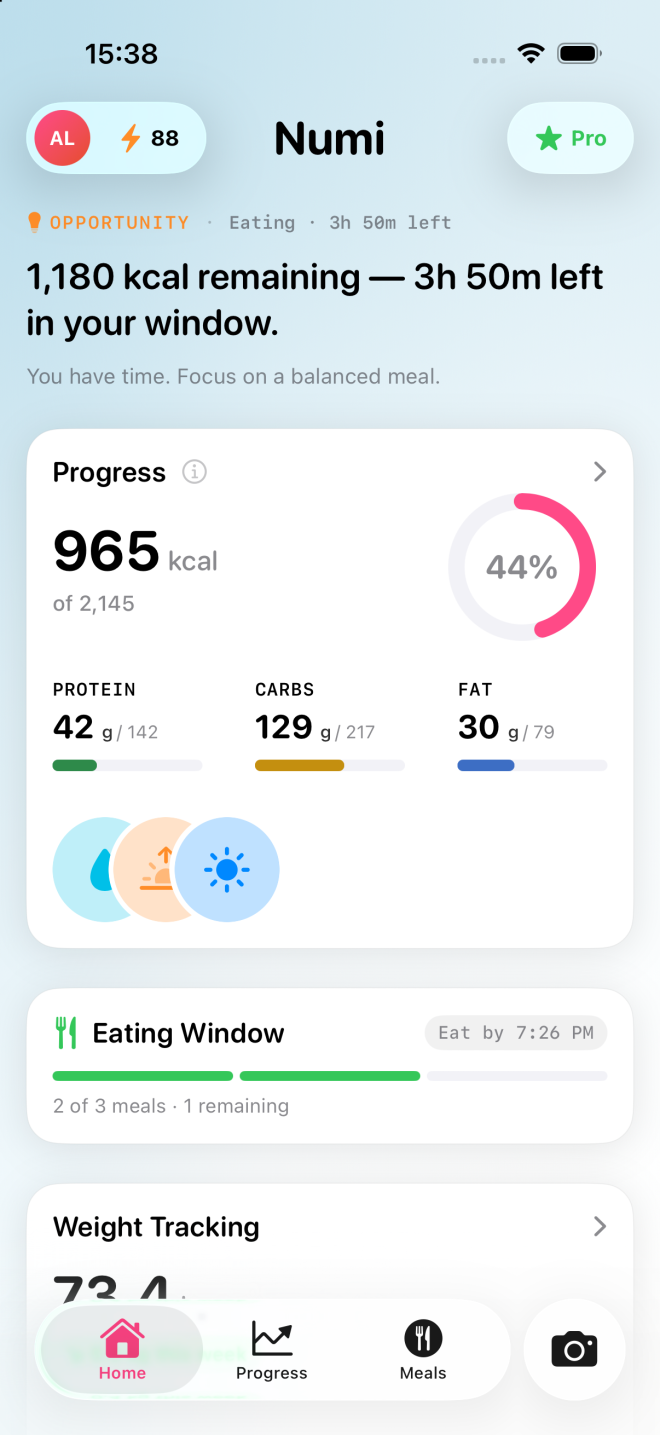
The shared denominator problem: when a tracker displays protein, carbohydrate and fat as percentages of the day's intake, all three percentages are divided by the same total. Eat less overall and every ring can sit perfectly on target while the absolute grams fall through the floor.
The arithmetic is worth doing once, slowly. Say your target is 2,200 kcal with 30% from protein. That is 660 kcal of protein, or 165 g. Now say you have a busy day and eat 1,500 kcal, still at 30% protein. That is 450 kcal, or 112 g. Your percentage display shows a perfect hit on both days. The gap between them is 53 g of protein, which is roughly two chicken breasts.
People in this situation usually conclude that macro tracking did nothing for them. What actually happened is that they tracked a ratio and assumed it reported an amount. Ratios are scale-free. Your body is not.
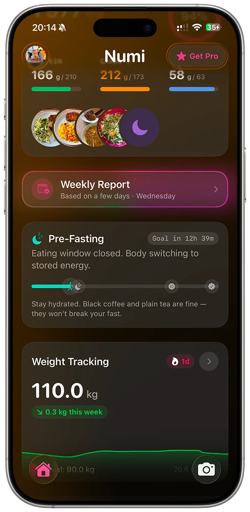
So: a macro tracker that shows you percentages as the primary display is showing you the least useful of the two available units. Grams remaining is the number that changes what you put on the plate at 7pm. Percentages are a summary you might glance at weekly, if at all.
You are not tracking three macros. You are tracking two floors and a remainder
Once calories are fixed, macros have only two degrees of freedom. Set protein and fat, and carbohydrate is fully determined by subtraction. There is no third decision to make. Yet almost every macro tracker presents three identical rings, implying three independent goals you are equally responsible for hitting.
A more honest structure, and the one I would build if I were designing the display from scratch:
- Protein: a floor. A number in grams you want to reach or exceed. Overshooting is rarely the problem.
- Fat: a floor. Below a certain intake, meals get less satisfying and cooking gets awkward. Again, grams, again a minimum.
- Carbohydrate: the remainder. Whatever calories are left after the two floors are met. This is your flexible budget, and it is where almost all day-to-day variation should live.
Framed this way, a day where you hit protein, hit fat, and came in 40 g under on carbohydrate is not a failed day with one red ring. It is a day where you ate slightly less than planned and every structural priority was met. The three-ring display makes that look like a failure. The floors-and-remainder framing makes it look like what it is.
Try applying this mentally to whatever app you are trialling. If the interface fights the framing, you will spend a year feeling vaguely non-compliant about arithmetic that never mattered.
Check how the app derived your targets before you trust them
Most trackers, including ours, calculate a baseline from the Mifflin-St Jeor equation and then multiply by an activity factor. The equation is well established and rarely the problem. The multiplier is where the damage happens.
Mifflin-St Jeor is used with multipliers spanning roughly 1.2 for sedentary through to 1.9 for very heavy physical activity. That is a five-band range. Plenty of apps compress it into three buttons labelled something like sedentary, normal and active.
Work through what that costs someone. Take a resting rate of 1,600 kcal. At 1.375 you get 2,200 kcal. At 1.725 you get 2,760. That is a 560 kcal daily difference produced entirely by which bucket a three-option picker dropped you into, and it compounds every single day. Your macro grams, being a proportion of that total, are wrong by the same fraction. Someone doing manual work or training six days a week gets pushed toward the middle of the range and is then told their maintenance is a deficit.
When I was building the onboarding for Numi, this is the part I refused to simplify, because the simplification is invisible. Nobody looks at a target of 2,200 and thinks "that came from the wrong bucket". They think "I must be doing something wrong", which is the worst possible failure mode for a tool that is meant to make you feel informed.
Practical check: during signup, count the activity options. If there are three, either find the setting that lets you enter your own number, or expect to adjust manually after a fortnight of trend data.
Ask whether the app will move your targets without telling you
There is a distinction worth insisting on: separate what the user decided from what the system worked out.
Your goal intent is yours. Lose, gain, maintain, a target weight, a date you care about. That rarely changes and it is not the app's to edit. Calories, macro grams and hydration targets are all derived from that intent. They are the system's output.
Apps get into trouble when they collapse the two. Progress stalls for a fortnight, the app trims 150 kcal off your target to "keep you on track", and now the number on your screen no longer corresponds to the decision you made. You cannot see the adjustment, so you cannot disagree with it. The next time you wonder whether your target is right, you have no stable reference to reason from.
Detection and action are different jobs. An app noticing that your seven-day weight trend has been flat for three weeks is genuinely useful. An app acting on that observation without asking is making a decision on your behalf that you cannot argue with. Say it and suggest it; do not silently do it.
The related test is how the app treats weight. Daily weight is dominated by water, sodium, food volume in transit and timing. A target that recalculates from this morning's reading feels responsive and is mostly reacting to noise. Trend over seven days is the signal. If your macro tracker recalculates the moment you step on the scale, it will teach you, gradually, to distrust its own numbers.
The correction tax: the number nobody puts in a comparison table
Every tracker gets things wrong. Photo recognition misjudges portion size. Barcode databases contain user-submitted entries with the decimal in the wrong place. Search returns forty variants of "chicken" and you pick one that is not what you ate.
What separates the tools is what I would call the correction tax: the number of interactions required to change a wrong estimate into a right one, measured from the moment you notice the error.
This matters more than raw accuracy, and here is why. A tracker that is right 90% of the time with a one-tap correction converges on a good log. A tracker that is right 95% of the time but buries the edit behind a modal, a re-search and a save confirmation does not, because you will skip the correction when you are standing up, holding a plate, with a toddler shouting. The skipped corrections all fall in the same direction: undercounted snacks, underestimated oil, meals logged as the closest available approximation.
The design conclusion I hold from this: the analysis is a proposal, not a verdict. A model commits to an answer whether or not it is correct. Presenting that as fact means each near-miss erodes trust in silence. Making correction a single tap turns being wrong into a normal part of the interaction rather than an error state you have to fight through.
When you trial an app, deliberately log something it will find hard. A mixed home-cooked stew. A plate with three components. Then time how long it takes you to fix the estimate. That measurement will tell you more about the next six months than any feature list.
How to pick the best macro tracker app in one week
Feature comparisons are cheap to write and hard to act on. Here is a protocol instead. Give any candidate seven days and run these checks.
- Day 1, onboarding audit. Count the activity options. Note whether the app tells you which equation it used. If it will not show you the derivation, it will not be auditable later.
- Day 1, unit check. Find where grams remaining is displayed. If you can only get percentages without digging, the shared denominator problem is baked into your daily experience.
- Day 2, hard-meal test. Log the messiest thing you eat all week. Time the correction.
- Day 3, repeat-meal test. Log something you eat regularly. If it takes the same effort as day one, the app is not learning your patterns and the friction will not decrease.
- Day 4, low-day test. Deliberately eat a lighter day. Does the app tell you that you are short on protein in grams, or does it show three contented rings?
- Day 5, insight check. Read whatever the app tells you about your week. If it says "Great job!" or "Keep it up!", ignore it entirely from now on. A generic insight is worse than no insight, because it is transparently not about you and it costs you the willingness to read the real ones.
- Day 7, stability check. Compare today's calorie and macro targets to day one's. If they moved, find out why. If you cannot find out why, that is your answer.
Nothing in this list requires you to pay for a year up front, and nothing in it depends on my opinion of any particular product.
What "best" looks like by the second month
In week one, the best macro tracker feels like the fastest one. By week eight, the criteria have completely changed. What matters then is whether the numbers have stayed still long enough for you to learn something from them.
That is the quiet argument for explainability over cleverness. A score or a target produced by a model you cannot inspect cannot be checked, argued with, or learned from. A deterministic number with stated inputs can be. When you disagree with it, you can find out which input you disagree with, change it, and understand what changed. That is the difference between a tool that informs you and a tool you simply obey until you stop.
Pick on derivation and correction cost. Everything else you can live with.